
 Sign In
 Create Account

You can find the previous two pictures at my DA account.


Undercover.

Dreamer

DreamWorld Detective
Undercover.
Oh! You updated it with the patterns! Very cool! *Steals it for desktop a second time*
Again, I really really love this, thanks so much for colouring it, it came out beautiful! *hug* I usually dislike my own work, but you made me forget that I drew it and I like it now. *Snort*
Undercover.
Dreamer
DreamWorld Detective

Dreamer


Undercover.
As you asked for crit... *puts on critical gloves*
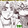
I'm gonna focus on the top image. The colouring on the figure is generally strong and fits nicely with the lineart, but there is something odd about the background. It seems like you've blurred it to make it out of focus, but not all the edges as as blurred as each other on the same object, that makes it looks more like you've just painted some with a soft brush rather than simulating depth of field. You can also get the sense of distance with colours: things further away often look a little less vivid than close up objects as well as being out of focus. The grass is nice but it might look better if some went in front of the windmill bases, to make them look more like they're on top of it. and also a little more shadowing could help give a better sense of form. Things have a little form shadow but no cast shadow in this, which looks a little odd. I'm also a bit confused on the light source, as the one just behind NiGHTS has it coming from the right and the next one back from the left. If this is because the Ideya are glowing, then a little reflected colour in them could help, and also making the glow of the Ideya lighten the things around them instead of being a halo of their normal colour, which looks much less like glow. There could also be more contrast between the ground and the front bit of grass, it kinda gets lost.
All of these things can be worked on in this peice and should make the background much stronger. It is a good start, but it can be much better.
Dreamer

Undercover.

Dreamer
Dreamer
Undercover.
Dreamer
Your Mum

Dreamer
 Guest_submas13_*


0 members, 1 guests, 0 anonymous users

Community Forum Software by IP.Board
Licensed to: Colin Barker
 Back to top