Jump to content

Welcome to NiGHTS COMMUNiTY
Register now to gain access to all of our features. Once registered and logged in, you will be able to create topics, post replies to existing threads, give reputation to your fellow members, get your own private messenger, post status updates, manage your profile and so much more. If you already have an account, login here - otherwise create an account for free today!

KiloTango's Content

There have been 217 items by KiloTango (Search limited from 01-May 23)


By content type

See this member's


Sort by                Order  

#44414 Your Cosplay

Posted by KiloTango on 21 March 2008 - 02:02 PM in Cosplay Zone

Except for the fact they're not actually from anything... But since you ask...

I don't know if you saw the ones I did for Ame 2007 either. *looks for pics of both*

Okay, 2006:
These took a couple of days, and confused the hell out of many people. Terrible photos ahoy! (And yes, that's a labcoat.)
Posted Image
Posted Image
Posted Image

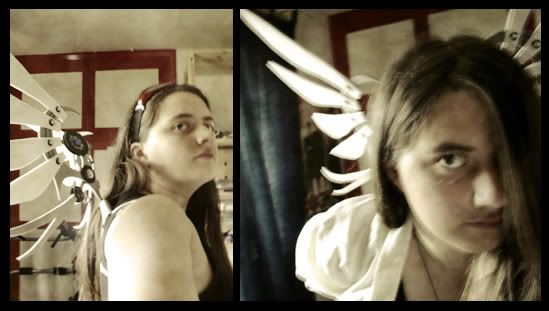
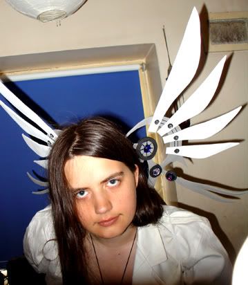
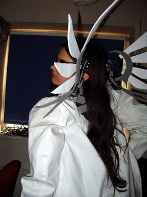
Materials: Coathanger wire, garden wire, funky-foam, costume gems, 3d paint, shitloads of copydex, double sided tape, elastic.


2007:
Sadly no good pics of me wearing them. These were fragile as hell, but they were made pretty much entirely in an evening, so it's not surprising. They lasted long enough for the con but no further.
Posted Image
Posted Image
Posted Image

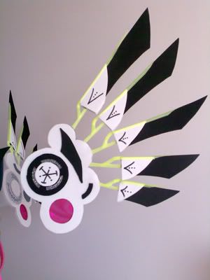
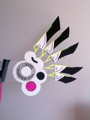
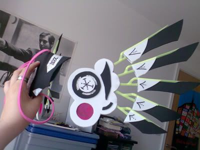
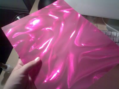
Materials: Funky-foam, plastic from an ice cream tub, clear plastic, the most awesome hologram pink plastic, drinking straws, plastic coathanger for the back support, stick on silver hologram film, black pen, doublesided tape and copydex, elastic and ribbon.

I haven't worked out what I'm doing for my 2008 ones.


#35908 Why DB Doesn't Draw Much NiGHTS Stuff Anymore

Posted by KiloTango on 16 January 2008 - 08:53 AM in Creative Stuff!

Deebs, that is awesome, shh.

Though if NiGHTS gives you art blocks, does that mean you are drawing other things? CAN I SEE THEM? :o

(I have lacked DB art.)


#12949 Who is your favourite comicbook character

Posted by KiloTango on 25 August 2007 - 03:07 PM in Community Corner

Just to say, the best 2000AD character is Nikolai Dante. (From the series of the same name)

He just is.

No really.

You can get some of his stuff in collected books, but some of them are hard to find. It's SF but based on Russian empire stuff, he's the bastard child of a nobleman and the queen of the pirates and is just the most swashbuckling awesome thing ever. :D

Look, he's just COOL!

There NEEDS to be a film. It would be SO good.


#12501 Who is your favourite comicbook character

Posted by KiloTango on 24 August 2007 - 01:53 AM in Community Corner

God, that's tough actually.

Spider Jerusalem from Transmetropolitan is pretty awsome. Also, Hellboy is great too (and so much better in the comics than the film.)

Manga wise, Eury Evans from Immortal Rain is pretty cool.


#12761 Who is your favourite comicbook character

Posted by KiloTango on 25 August 2007 - 01:29 AM in Community Corner

It's a chronic shame there aren't more European comics that get translated. There's some STUNNING French and Belgian stuff that never gets to an English speaking audience, it's such a shame.


#44640 Which Graphics Tablet?

Posted by KiloTango on 23 March 2008 - 11:51 PM in Artwork

As for me, I was going to look into Wacom though I've heard Bamboo is not bad at all


Bamboo IS Wacom. It's just the name of one of their ranges.


#44515 Which Graphics Tablet?

Posted by KiloTango on 22 March 2008 - 07:28 PM in Artwork

I used a trust for a while as a stand in for my old tablet and really didn't like it. There were batteries to contend with, the pen was really chunky and not especially comfortable, and the resolution and pressure sensitivity just wasn't good.

If you want a cheaper option but keeping Wacom quality, Wacom have just brought out a new range called 'Bamboo' which is cheaper than the graphire and intuos series and could be a really good place to start.

Also, you don't NEED an a4, or even really an a5 when you're starting out. I began with an a6 UC-Logic 'Super Pen', and then switched to an a5 Intuos 3 when I was ready to invest in something a bit pricier. The superpen site looks a bit dodgy, but I bought mine in a shop, it did me fine for years and was fairly cheap.

But yeah, at the moment Wacom make 3 main ranges that are use for artists. The Graphire, which is their general range, the Intuos which is more expensive but with better resolution and some more features (as it as tilt control senstivity as well as pressure) and the Bamboo which is cheaper and more entry level. It sounds like the Bamboo might be what you're after.


#44837 Which Graphics Tablet?

Posted by KiloTango on 26 March 2008 - 09:48 AM in Artwork

That tablet tutorial is very good. The main thing that will throw you off at first for a while is not looking at what your hand is doing, but at the screen instead. And, as mentioned, the posture. (When I draw on paper it's usually on my lap. When I work with my tablet it's to my right and higher up. Which is very different.)

And Photoshop is a great program. It has quite a learning curve, especially in later versions which are PACKED with features *hugs her copy of CS3* but it's worth the time you put in and you can get some stunning work with it.


#44688 Which Graphics Tablet?

Posted by KiloTango on 24 March 2008 - 05:35 PM in Artwork

I tried not to mention cintiqs because it would only make us all sad we don't have them. ^_^


#12962 What are your most wanted games?

Posted by KiloTango on 25 August 2007 - 03:15 PM in Community Corner

Mother 3, in English, that I can play on my DS.

PLEEEAAAAAAAAAAAAAAASE NINTENDO YOU KNOW YOU WANT TO! *pleads*


#21120 What are your favorite Manga Series'?

Posted by KiloTango on 16 October 2007 - 10:24 PM in Community Corner

Samura has done other things!? Where can I find these? Blade of the Immortal is AMAZING, I'd love to see any of his other work.


#35689 What are your favorite comics?

Posted by KiloTango on 15 January 2008 - 01:21 AM in Community Corner

Blue Monday totally counts! (Not that it matters, but the graphic novels for BM were released in single 'floppy' issues as mini series anyway, the graphic novels just collect each miniseries.)

(And is awesome. It was one of my favourite comics when I was in high school and I still love it. I have a sketch of Clover by Chynna Clugston-Major somewhere. :) )

If you like that, have you ever read Scooter Girl? It's by the same person.


#31020 What are your favorite comics?

Posted by KiloTango on 19 December 2007 - 04:16 AM in Community Corner

Scott Pilgrim, Runaways, Powers, Invincible, Fell, NEXTWAVE... too many to list....

However one I've got into recently that I freaking LOVE is 'DMZ'. Set in a near futures/alternate present where America is going through a new civil war, it's the story of Matty Roth, an aspiring photo journalist who becomes embedded in the Manhattan war zone. It's got good writing, great art and is utterly compelling.


#27802 What are you listening to right now?

Posted by KiloTango on 29 November 2007 - 02:08 AM in Community Corner

Security, by the Freestylers. Though having first heard it in an awesome breaks set it sounds weird hearing it at its original slower speed. Still an awesome tune though.


#14800 Webcomics

Posted by KiloTango on 02 September 2007 - 10:32 AM in Community Corner

Oh, SOMEHOW I forgot to mention my very favourite webcomic at them moment, Under Lock and Key. It is just pure awesome. Good writing, nice characters, and GORGEOUS artwork. You should totally be reading it.


#12856 Webcomics

Posted by KiloTango on 25 August 2007 - 09:37 AM in Community Corner

Yeah, loads of webcomics are lame, but some can be funny. My ones...

xkcd- Swings between absolute briliance and just bizzare or cute geekery. And all in the writing cause it's just stick figures.
Achewood- I love Phillipe. It's great but only becomes funny really once you've read a lot of it.
Perry Bible Fellowship- Possibly the best web comic ever. Surreal and very funny.
Lackadaisy- Absolutely beautifully drawn, it manages to do anthro cats without being 'Furry'. Instead it's an awesome story of prohibition America and mobsters, that is both funny and engaging. Well worth having a look at.


#44642 Webcomics

Posted by KiloTango on 23 March 2008 - 11:54 PM in Community Corner

http://alexspectre.smackjeeves.com/

This guy is the don at lighting. Really lovely stuff.


#42451 TRiP's other OTHER art

Posted by KiloTango on 28 February 2008 - 09:26 AM in Artwork

See, I thought $28 was a pretty fair price--in fact, a little bit lower than I was expecting. But now that I know you get a little less than a fourth of what we're spending...it would feel as if I were stealing from you.


That's how publishing works. Most of of the time, a lot of the cover price goes to cover manufacturing and distribution.

Lynne: On your comic, have you thought of pitching it to Image? If they pick it up, you'd have pretty good comic shop distribution, and they've published some really interesting indy-kinda stuff lately. (Mmmmm, Phonogram.)

Just a thought, it might be worth looking into that when you've drawn the first issue before going straight to vanity press.


#54480 TRiP's other OTHER art

Posted by KiloTango on 16 June 2008 - 09:39 AM in Artwork

I shall swap it to grey.


Try just filling a layer with black and changing the opacity for your test background. That way you also have the square pattern of the transparent background to help you see where you've not filled things in and you can change it very quickly to help you see light or dark areas. (Also it's a neutral colour so it won't throw off your colour balance in the way using red or blue might, although if you're going to do a coloured background it may be best to use that colour as your working background to make sure you pick the right colours to go with it.)


#50565 TRiP's other OTHER art

Posted by KiloTango on 11 May 2008 - 11:23 AM in Artwork

Yeah, I've seen the pointy brackets thing done in a lot of stuff.


#27691 TRiP's other OTHER art

Posted by KiloTango on 28 November 2007 - 01:48 PM in Artwork

I'm digging the textures on the little blue guy's shiny things. Especially his wings, those are lovely.

I'm glad you're finally doing your own thing with it.

Minor nitpick, you've got some odd anti aliasing going on around the characters. I've got a feeling this is because you're cutting the images out after you finish them... if you want I can tell you a method on photoshop not to have to do that (but I won't spam your thread with it if you don't need it <_< )

Oh, actually, this might sound a bit weird, but now they're not in your stuff any more, would it be okay if I used someone similar to Grey and Ghost in my own dream thing. Grey probably wouldn't be all that similar to your design and obviously her background would be completely different, but there were some things about her and her little not-quite-imaginary friend that like and it'd be a shame for them to die off completely. If you don't want me to, it's okay, but I thought I'd ask.

(Cause come on, Grey and Leighton bitching about how much everyone sucks and never listen to them while playing Jue de Tarot over a cup of tea needs to happen. NEEDS.)


#35448 TRiP's other OTHER art

Posted by KiloTango on 13 January 2008 - 05:30 PM in Artwork

Faceted stones might be hard to find, but you could probably track down someone who could cut you perspex stuff. (Which in some cases would have the bonus of glowing awesomeness.)


#54306 TRiP's other OTHER art

Posted by KiloTango on 13 June 2008 - 08:46 PM in Artwork

Re: Eyeburn, make sure the room is well lit, it really helps.

And take BREAKS. For added glare-avoidance, don't use white as your background colour. Even photoshop's grey and white transparency grid is better. Make a white background layer to test stuff with, but the less white you have going on in general while you work, the less bright the screen and the less strain on your eyes. :)


#37831 TRiP's other OTHER art

Posted by KiloTango on 26 January 2008 - 12:08 PM in Artwork

The inner printing is sharp too, it tends to print darker/stronger than your source file though so always remember that when coloring.


The other thing to remember on that front is that if you're printing (and colouring in a program advanced enough to do such things), make sure you work in CYMK mode instead of RGB mode. It'll have to get converted somewhere along the line (because of how printers work) so you might as well do it yourself from the start to make sure the colours are as vivid and awesome as they can be.

(Stuff coloured in RGB and then just converted instead of working in CYMK from the start can come out looking much duller and muddier than it would otherwise. There is complicated stuff with colour gambits involved, but you don't really need to know about that, just that if printing, CYMK, if for screen, RGB.)

The book looks lovely. Very cute little drawings in it. Good luck with the other parts!


#55099 TRiP's other OTHER art

Posted by KiloTango on 25 June 2008 - 06:04 AM in Artwork

Actually, biscuit was from an old topic on the rules of being a Gen, and was one of the names given as examples of what not to do (The other was DiSCO SPARKLYPANTS or something). Then I got bored and actually drew her: http://www.chaoslace...sc/biscuit1.JPG

I don't think it really had anything to do with Amber.

SO NOW YOU KNOW. Don't you feel better?