
 Sign In
 Create Account
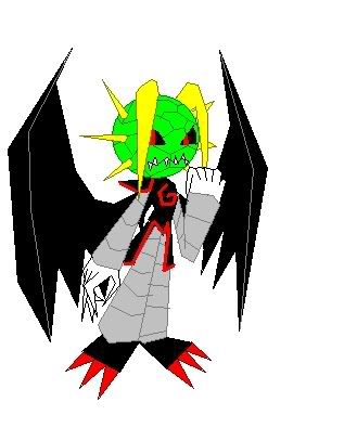
and just to show you where you may have seen him before. he was on my signature for a while!

OVERLORD

Dreamer

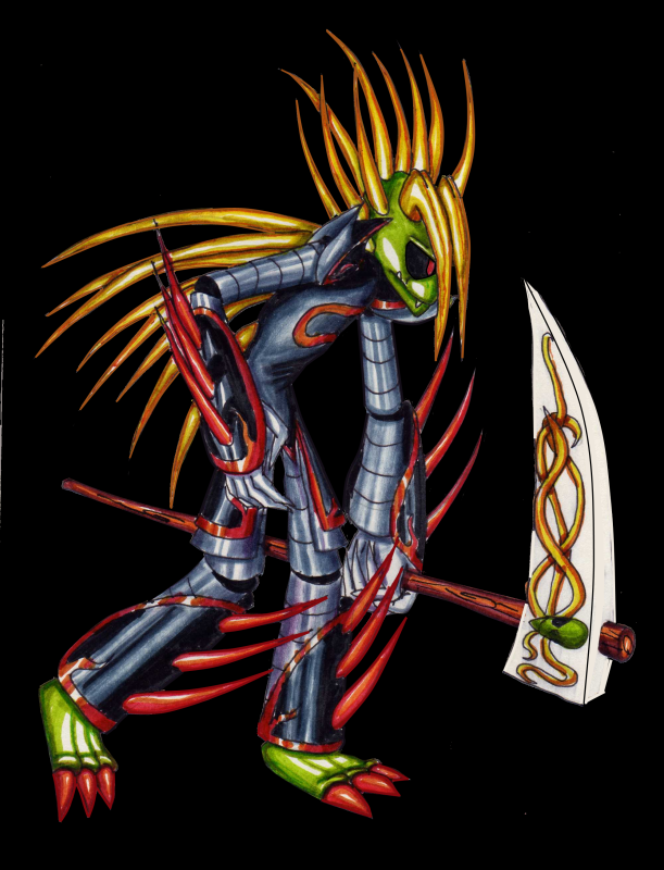
OVERLORD
Oh, nice! I like the second picture; the coloring is really well done.
 i use marker pens to colour in and put tone in
Dreamer

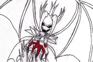
OVERLORD
Nice work I like the second one too
 and i find the difference between the first and second pictures quite amusing
Dreamer
OVERLORD
but i shall definitely try to improve on my lines! and i just didn't bother to edit the picture to get rid of the colour running-ness, the pens i use can sometimes be too thick for parts and their smaller equivalents release too much ink and mess it up. i should really invest in photoshop!
OVERLORD
Crazy Regular
OVERLORD
OVERLORD
plus, the blade is supposed to not have any tone, for storyline purposes oh, i just realised, the topic's called devil and shikisai, but i haven't uploaded any pictures of shikisai!  i shall get onto that!


0 members, 0 guests, 0 anonymous users

Community Forum Software by IP.Board
Licensed to: Colin Barker
 Back to top